Beaujana’s Mobile French Table back
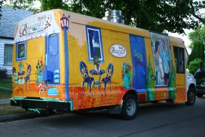
This was a fun, playful utility vehicle painted to take Beaujana’s French Table on the road. By making Beaujana’s mobile, it would allow the couple to travel to outdoor events such as the Winnipeg Folk Festival, selling food from the van. When Randy drove the van to me, I thought it was a white handy-van with tinted windows. After I painted it, it looked like a circus van able to attract children from all over. The owners, Randy and Beaujana wanted to make a big impression by painting it with bright, brilliant colours. I think they attained their goal. I had the commission for the mural but since Take Pride Winnipeg cannot fund the painting of a van, I did this gratis.
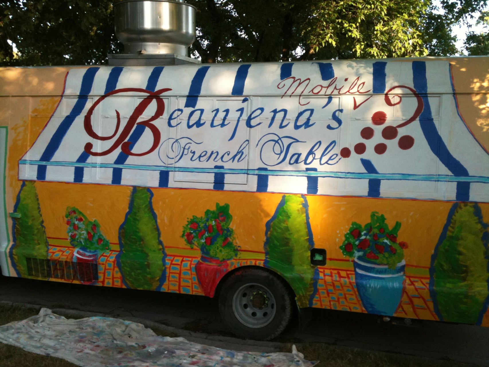
The idea was to make the van reflect the restaurant and the new look they would be creating with the wall. The only problem was, I had to paint the van first because they needed it for an event. This proved difficult to do especially since I only did a rough sketch of the main forms and did not do a coloured rendering. When Beaujana came to see how I was doing, she was unhappy with the way it looked but when she showed me a photo of a sylistic image she had in mind, I immediately changed it. She wanted a very simple graphic image and I was doing the trees in detail and painting it to look realistic, not the way she wanted it. Anyhow, I finally understood and made the appropriate changes. Due to the short timeline and my promise, I tried to paint as fast as I could. Unfortunately, as we all know, when we rush, we make mistakes. Well, I ended up falling off my step ladder and landing on my tush. Initially I was fine, but later I discovered difficulty sitting and apparently had a bruised tailbone. Another time, I spilled paint all over the road which was a little obvious and embarrassing. I usually pride myself on my ability to be neat.
For imagery, they wanted it to be an extension of Beaujana’s French Table; featuring their bright colours, signature table and chairs, sign, blue and white awning, and Beaujana’s friendly dog. They had me paint over most of the windows and duplicating their logo, hedges, and address on more than one side. I wanted to put a reflection of them in the window but it ended up looking like a painting on the wall. The perspective is a bit off making it look awkward, but we decided it was passable for their purpose. The flower pots and shrubs worked out exactly how she wanted them and I think they were happy with the results. When it was all finished I had it clear coated with an automotive finish to protect it from dirt and the elements. I was glad when it was finished because that meant I could get started on the wall, which was my ‘baby’!

